Ye’ai Tea
Brand Identity | Art Direction | Marketing Design | UI Design
From Mountain Origins to Meaningful Ritual.
Background
This project was about creating the brand for a pu’er tea sourced from the founder’s family region in Yunnan, China, and preparing it for the European market. The goal was to build a clear brand identity across packaging, website, and social media that shows the tea’s origin, authenticity, and modern appeal.
This project was about creating the brand for a pu’er tea sourced from the founder’s family region in Yunnan, China, and preparing it for the European market. The goal was to build a clear brand identity across packaging, website, and social media that shows the tea’s origin, authenticity, and modern appeal.
Challenge
Pu’er tea is still quite unfamiliar to many people in Europe, and the idea of aged tea can be confusing. The challenge was to present the tea in a way that feels trustworthy and premium without using obvious cultural clichés, while making the brand easy to understand and approachable for new customers.
Pu’er tea is still quite unfamiliar to many people in Europe, and the idea of aged tea can be confusing. The challenge was to present the tea in a way that feels trustworthy and premium without using obvious cultural clichés, while making the brand easy to understand and approachable for new customers.

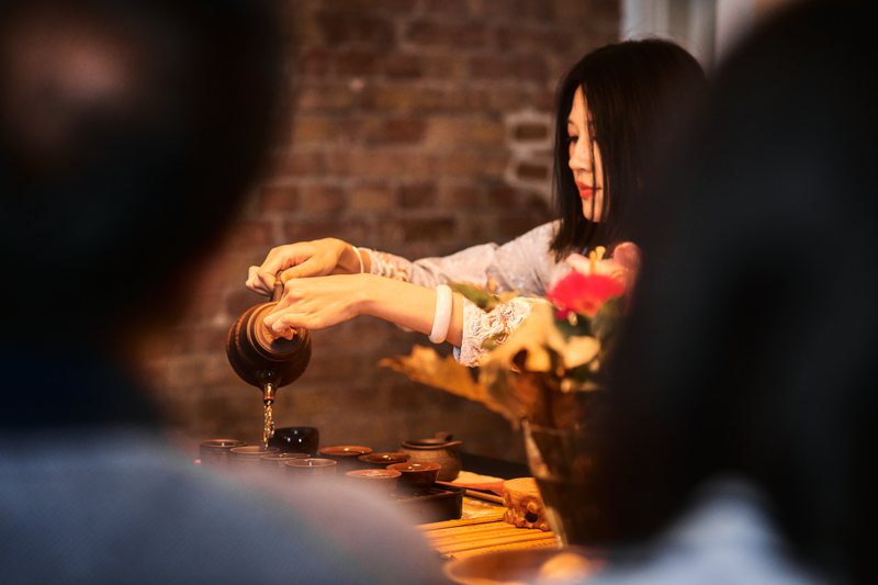
I invited people to a tea ceremony with the founder, Xin Ye, because Pu’er is best understood through experience. Seeing guests taste, ask questions, and respond in real time revealed what felt premium, what felt unfamiliar, and what needed clearer explanation. That became a key input for how we present the brand in a modern, approachable way.
The ceremony went better than I expected. Pu’er is bitter and earthy, so I thought it might be polarizing, but most people were genuinely into it. Once the founder explained the story behind the tea and how aging works, the taste felt less “weird” and more intentional. Here’s what I learned from their feedback:
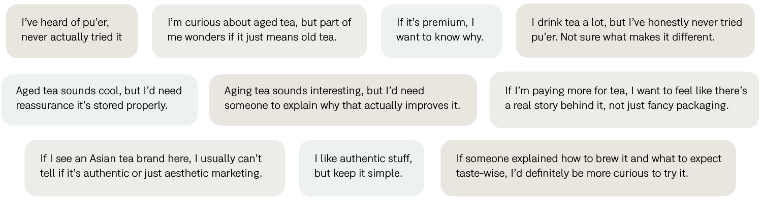
After the tasting ceremony and follow-up research, a clear pattern emerged: people are curious about pu’er, but they need simple education and strong trust signals before they buy. Based on that feedback, Ye’ai Tea is positioned as a calm cultural authority rooted in direct Yunnan sourcing. Instead of chasing lifestyle trends, we focus on origin transparency, clear explanations of aging, and quiet credibility. The founder becomes the guide and curator, making pu’er feel intentional, approachable, and worth its premium.
Logo System Concept
In the early exploration phase, I considered a minimal wordmark approach. However, “Ye’ai” has a non-native pronunciation that may feel unfamiliar to a European audience. Relying only on typography would make early recognition more difficult. For this reason, I developed a combined logomark and wordmark. The wordmark ensures clarity, while the logomark adds a distinctive visual anchor and connects the brand to its cultural origin.
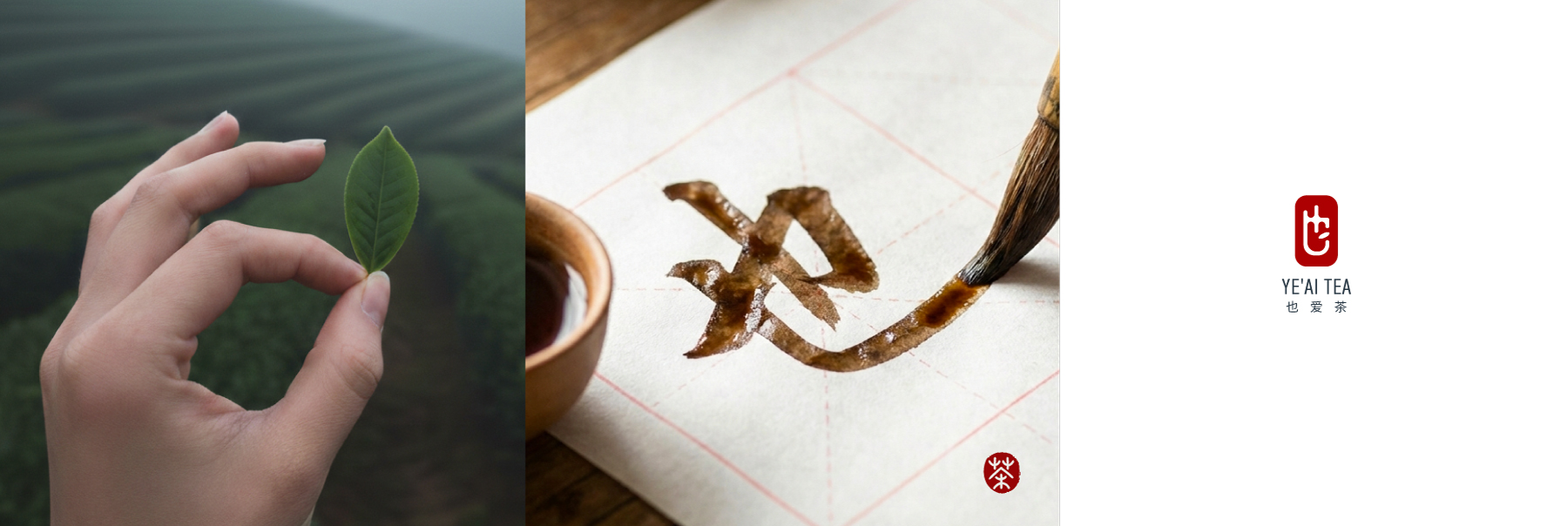
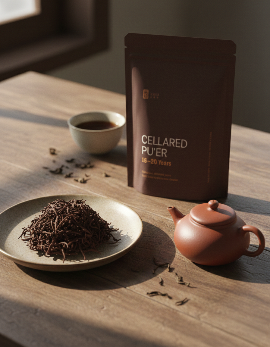
The logomark is based on the Chinese character 也 (Ye), taken from the founder’s family name to keep the brand rooted in its origin. A small leaf is added as a quiet signature, hinting at hand-picking and the craft behind the tea. The shape is inspired by a traditional Chinese red seal, often used to sign work and mark authenticity. It adds a sense of origin and heritage, while staying clean and modern for packaging and digital use.
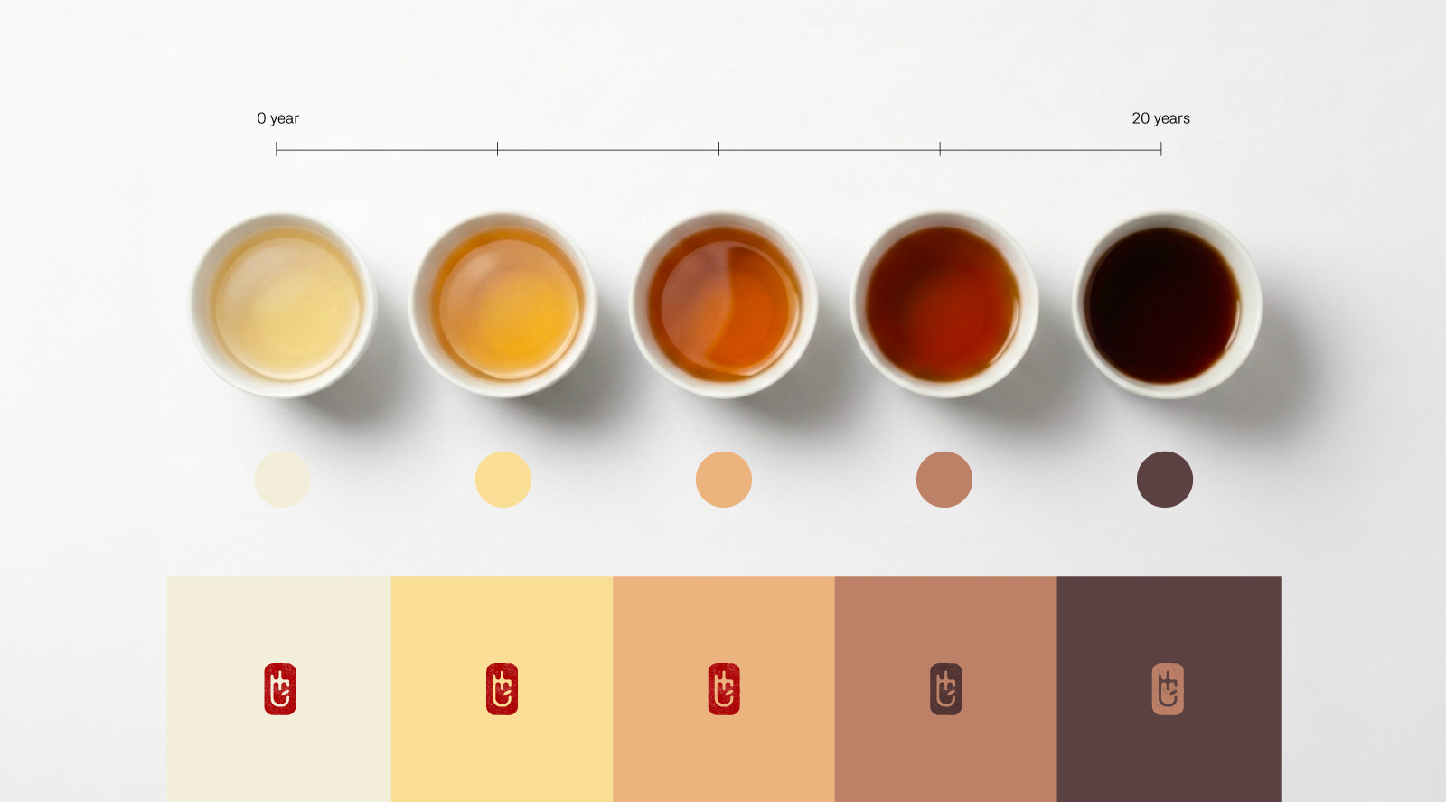
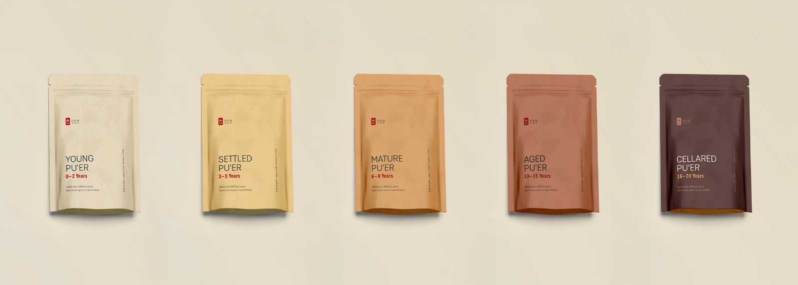
After finalizing the logo, I developed a color system specifically for the packaging. The palette is inspired by the natural shades of pu’er tea across different aging stages, moving from light golden tones to deep, earthy browns.
Each packaging variant uses a distinct shade to signal its stage, making the product range easy to understand at a glance while staying rooted in the tea itself.