Fjørde & Co
Client: Wayfair GmbH
Client: Wayfair GmbH
Branding | Visual Identity
Warm minimalism, made iconic.
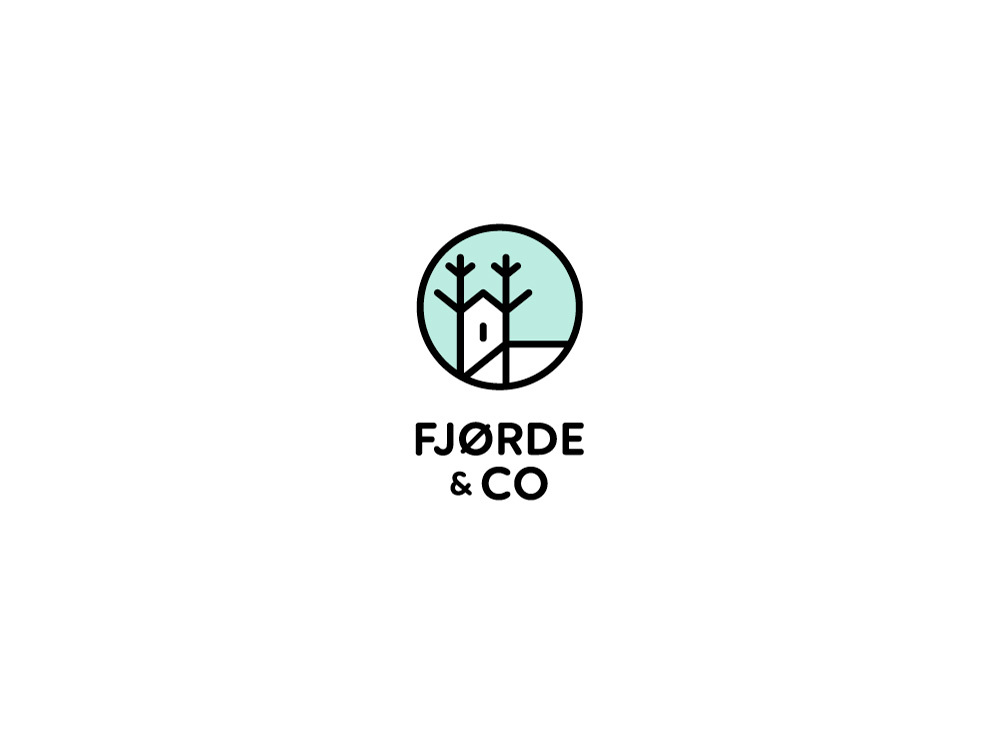
Fjørde & Co is a home furniture brand combining a retro sensibility with Scandinavian influences to help you create a simple but cool environment. The logo mark combined the tree branches and a home symbol into a deer face. The geometric and linear style reflects the core values of the brand: minimalism, light and honest look.
This project was selected as a finalist in the Corporate Identity category of the 17’ Taiwan International Graphic Design Award (TIGDA), endorsed by the International Council of Design (ICoD). It was exhibited in the Tung Fang Design Institute-Shigeo Fukuda Design Museum.
Other mentions:
Hiiibrand Awards - Merit, Logo Wave #3, LogoLounge#10
Other mentions:
Hiiibrand Awards - Merit, Logo Wave #3, LogoLounge#10

Furniture Characteristics
The brand’s furniture design language is defined by:
-
Straight and clear lines, smooth surfaces
-
Focus on angular shapes, but also round and organically curved shapes, lending the furniture an extraordinary design
-
Thin or tapered outwards pointing table legs made of wood or metal
-
Natural materials including wood, cotton, linen and furs, as well as metal accents
- White, black, light wooden tones, pastel colors, as well as bright friendly looking colors


Design Concept + Approach
Fjorde & Co is about creating a home that feels warm, light, and connected to nature. The logo captures that through three visual cues: a branch (nature), a home (comfort), and a deer (personality and calm presence).
The mark was designed using clean geometry and consistent line weight to match the brand’s minimal Scandinavian style. By merging the three symbols into one cohesive form, the logo stays timeless, scalable, and recognizable across digital and print touchpoints.